
 SDN BHD")


Why Do Some Stainless Steel Lettering Signs Look "Cheap" Instead of Premium? 5 Common Design Mistakes in Malaysia
In Malaysia's commercial landscape, stainless steel lettering has become one of the most popular choices for upgrading corporate storefronts and brand facades.
However, the real difference in outcome is very obvious:
Some stainless steel signs look premium, modern, and well-designed
Others feel ordinary, or even "low quality" despite using the same material
The issue is usually not the material itself, but the design strategy and execution details.
This article breaks down the 5 most common design mistakes, helping businesses in KL, Selangor, Kuantan, Penang, and Johor Bahru avoid costly visual errors and achieve a truly high-end brand appearance.
5 Key Stainless Steel Lettering Design Mistakes Explained
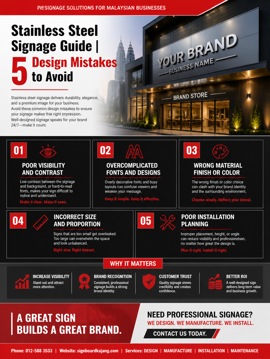
Mistake 1: Choosing the Wrong Font (Directly Affects Brand Perception)
Typography is one of the most important factors that determines whether stainless steel lettering looks premium or not.
Common issues: Using overly thin fonts (Thin Font), using decorative fonts (Script / Fancy styles), unstable or inconsistent letter structure.
Why does it look cheap? Stainless steel is a material that emphasizes structure, stability, and strength. When the font is too thin or overly decorative, it weakens the overall visual balance and support.
Correct approach: Use medium-weight fonts, prefer clean Sans Serif typefaces, keep the structure clear and easy to read.
Core idea: Typography defines the first impression of your brand.
Mistake 2: Poor Proportion & Spatial Design
Many signage pieces look "odd" not because of the material, but because the proportions are wrong.
Common issues: Text is too small and unreadable from a distance, overly tight letter spacing creates visual pressure, logo and text are not balanced in size or hierarchy.
Correct approach: Design size based on viewing distance, maintain proper spacing between letters, establish clear hierarchy between logo and text.
Core idea: Proportion is the foundation of a professional look
Mistake 3: Wrong Surface Finishing (Instantly Downgrades Visual Quality)
Up to 70% of stainless steel lettering's premium feel comes from its surface finishing.
Common issues: Mirror finish used in the wrong context (too reflective, feels cheap), inconsistent brushed texture, finishing not aligned with brand identity.
Correct selection logic:
Mirror Finish → High-end retail / showrooms
Brushed Finish → Corporate offices / developers
Matte Finish → Medical / tech brands
Core idea: Surface finishing defines brand personality and perceived quality
Mistake 4: Poor Lighting Design (Ruins Night-Time Appearance)
In Malaysia, night visibility is a key factor for signage performance.
Common issues: Lighting too strong (harsh and low-end feel), no depth or layering (flat illumination), exposed light sources that break the premium look.
Correct approach: Use hidden LED lighting systems, apply soft backlighting (Halo effect), control brightness and lighting layers.
Premium feel comes from controlled light and shadow, not brightness alone.
Mistake 5: Ignoring Installation Environment & Background Context
Stainless steel lettering does not exist on its own — it is always part of a physical space.
Common issues: Ignoring the background wall color, overly complex surroundings that reduce visibility, applying indoor design logic to outdoor signage.
Correct approach: Outdoor signage: high contrast + clean, simple design. Indoor signage: focus on detail and material texture. Always ensure the background supports and enhances the lettering.
Core idea: The surrounding space determines the visual impact
How to Achieve a Premium Stainless Steel Look?
If you want to elevate your brand visual identity, follow these three principles:
Less is More — simplicity creates elegance
Proportion First — structure matters more than decoration
Context Design — always design according to the space
Key insight: The premium look of stainless steel lettering is not defined by the material, but by the design thinking behind it.
Malaysia Market Trends
In Malaysia, branding and signage design are rapidly evolving:
- Corporate headquarters → Brushed Stainless Steel Lettering
- Property developer projects → Large-scale metal 3D lettering systems
- Medical aesthetics / high-end retail → LED + stainless steel combinations
- Shopping malls → Multi-material integrated signage systems
Trend conclusion: Stainless steel lettering is evolving from a "signage material" into a complete brand visual identity system
FAQ
1. Does background affect stainless steel lettering?
Yes. The color and material of the background directly impact readability and the overall premium feel.
2. Can stainless steel lettering be combined with other materials?
Yes. A common combination is stainless steel + acrylic + LED lighting to enhance visual depth and brand impact.
3. Is stainless steel lettering suitable for chain brands?
Absolutely. It offers strong consistency and can be easily replicated across multiple locations.
4. Does thickness affect the final result?
Yes. Thicker lettering creates a stronger 3D effect and visual presence.
5. Can it be installed on curved walls or special structures?
Yes, but it requires customized design based on the site structure and installation conditions.
If you are looking for professional stainless steel lettering design and fabrication in Malaysia, we provide complete brand signage solutions, including:
Custom stainless steel lettering design and optimization
Mirror / Brushed surface finishing options
Corporate logo wall and storefront signage systems
Shopping mall / office / commercial space signage planning
Installation services across KL / Selangor / Kuantan / Penang / Johor Bahru (West Malaysia)
Call / WhatsApp Us: 012-588 3533 Website: signboardkajang.com
Disclaimer: Information provided is for reference only. We do not bear responsibility for any inaccuracies or consequences arising from its use.